Property Lords
Property Lords is an interactive real estate app with an easy-to-use user interface that will help customers in searching their dream home. With the focus on visual appeal, by blending functionality and aesthetics, the aim was to elevate the user interaction experience.
Student project for UI Specialization
Client
To design a web app for first-time property investors
Goal
UX/UI Designer
Role
Figma
Canva
Tools
Challenge
Design a web-based app with user-friendly experience, to assist first-time home buyers in finding their perfect home, based on the user research provided by CareerFoundry.
Solution
Users need a real estate app with an easy-to-use user interface that will help them in finding their homes. A glitch-free search that offers multiple filters to narrow down the results, Save properties as a favorite list to view later and Connect with realtors and property sellers all in one place.
Process
With provided user persona and user stories, created 3 user flows. Design Procedures for Low-fidelity wireframes were derived from user flows. A deeper analysis of the brand's identity along with visual cues, provided the foundation of the design guide. Ultimately, all the different UI elements combined together to create the final high-fidelity prototype.
User Persona
The persona-Rashida, was pre-defined. She is an IT consultant with a keen interest in technology. Her ambition was to explore the realm of real estate investing for the first time. She planned to quickly gather relevant data and find property opportunities that align with her life's style and financial goals.
User Flows
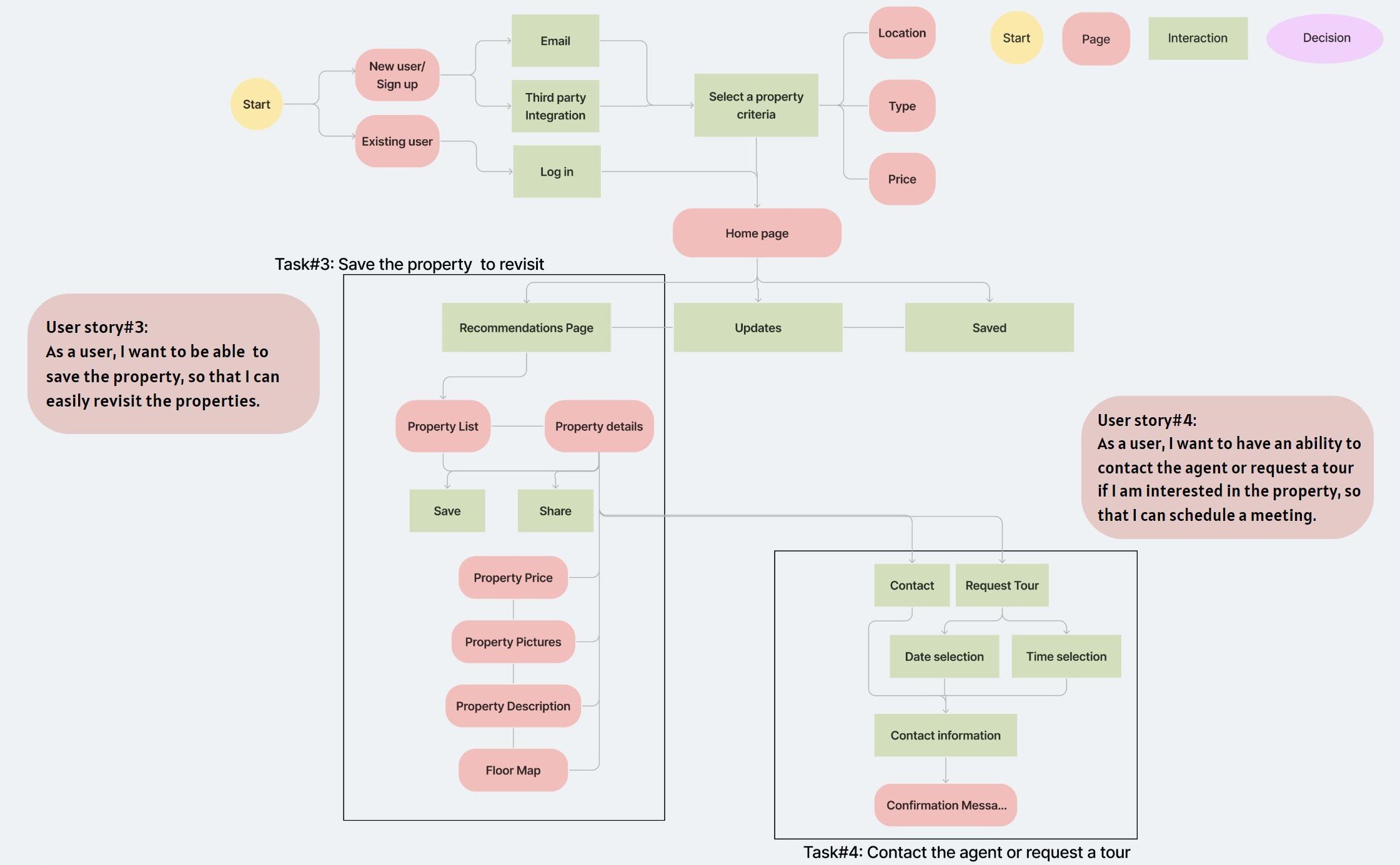
Based on pre-defined user stories, I created 2 user flows for 4 user stories to map the user experience and overall use of the main features: set up property criteria, searching for properties, save the properties, and contact a property agent.
User Flow#1
User Flow#2
Early Ideation
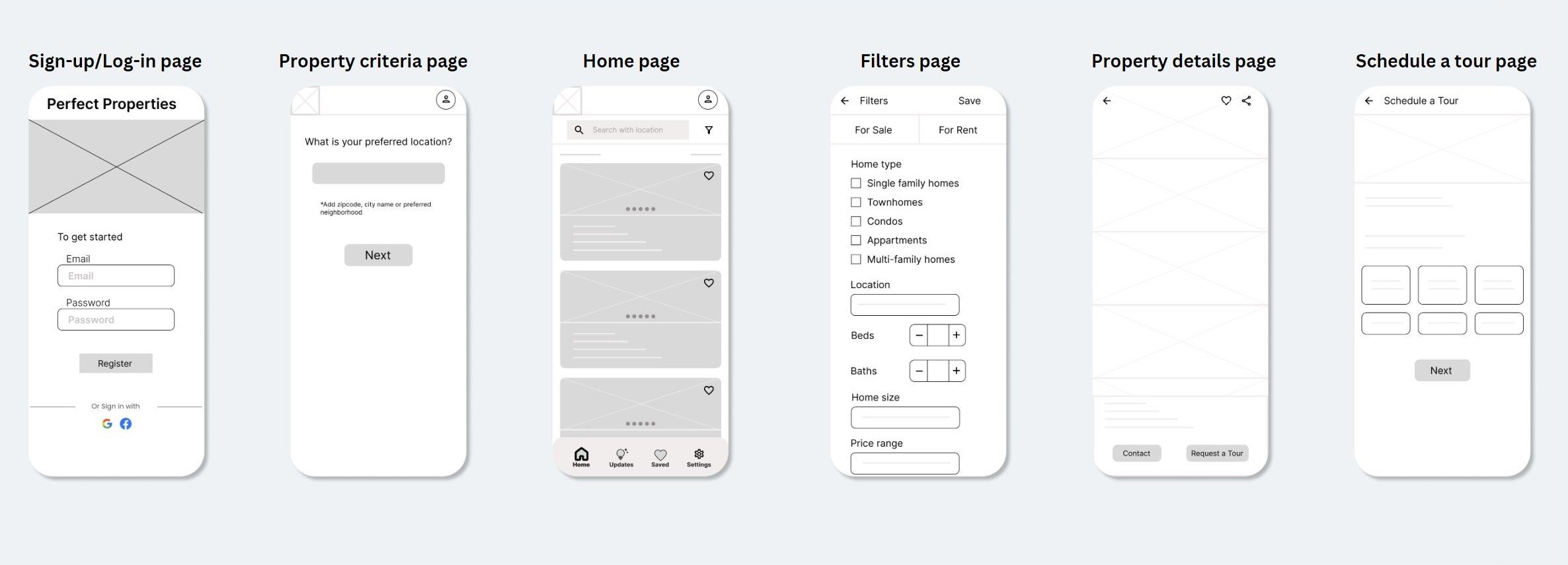
Beginning with a simple sketch and iterative ideation process, I created the low-fidelity wireframes to showcase the framework of the user flow.
Low-fidelity wireframes
Responsive Designs
Mid-fidelity wireframes were developed to display a visual interpretation of the structure, marking exact spaces, titles, and navigational hints. These were formulated with the aid of the design tool, Figma, to ensure completeness and precision.
Mid-fidelity wireframes
Responsive Designs
Mood Boards
For the visual aspects, I created 2 mood boards, out of which I decided to use one (image below). The mood board encompasses a sophisticated yet, rich neutral tones that works well with contrast. The visuals represent an instinctive design and each part has significance that facilitates understanding and choices of investors. The keywords (comfort, peace and balance) are essential elements many people desire in a home, potentially appealing to a wider audience.
Later on, I shifted the color palette from the inspiration board to fresher hues for boosted refinement and increased functionality through proportionate color variations - each hue fulfilling a distinctive part in my design - to more effectively align with the app's inclusive branding, visuals, typography, and so forth.
Interactions and Animation
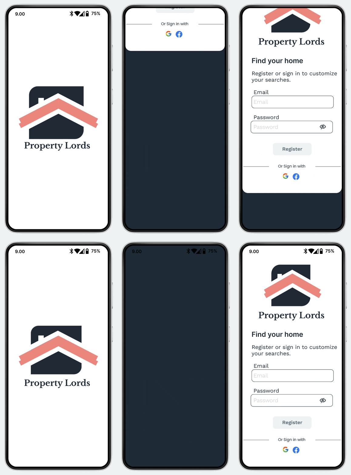
Animation-Landing page
Interaction- Share Overlay
Interaction- Navigation bar
Style Guide
Property Lords' design principles are grounded in a modern yet interactive framework. This calls for a design highlighting dynamic colors, modern and readable typefaces, captivating imagery, engaging user interaction, and seamless transition across pages.
Final Design
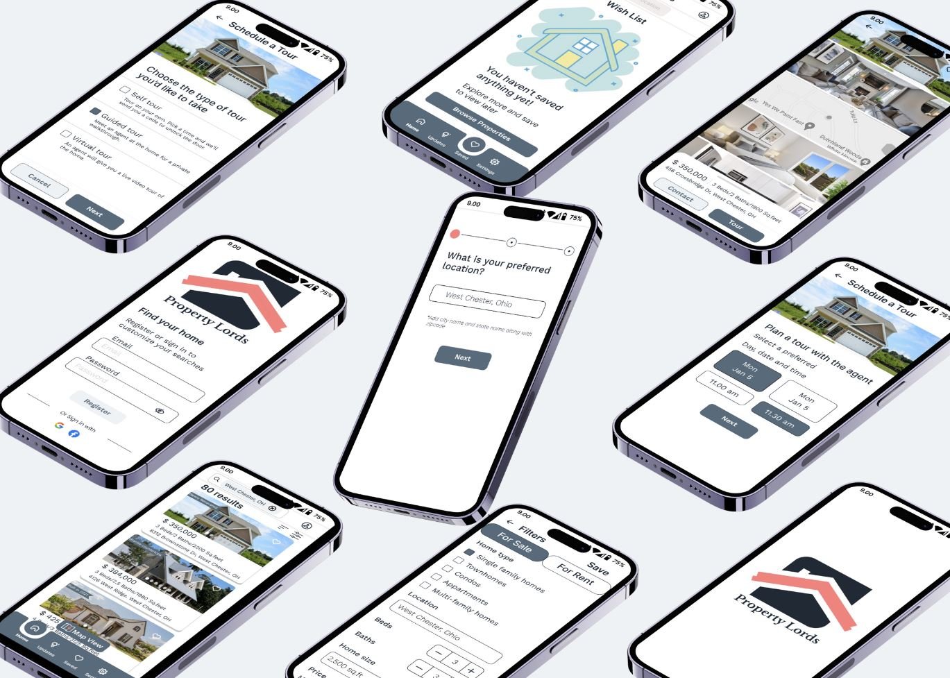
The intermediate designs and aesthetic guidelines were put together over multiple iterations to fabricate high-fidelity prototypes.
Breakpoints
The concept of mobile-first design was applied to create a responsive web application, meaning a site that can be accessed from any device. This strategy allowed the app to reconfigure its content in response to the specifics of the device used.
The example of Property Lords shows how the design adapts to functionality and user engagement across devices. This design methodology underlines versatility, ensuring that user’s experience similar functionality and consistent aesthetics, regardless of screen dimensions.
My learnings
My initiation into the realm of UI design was through the project, Property Lords. It gave me an insight into how UI design is different from UX design and how they should work together for a better customer experience.
As I made progress in the project, my screens went through multiple iterations. With each realization about UI, I ensured to incorporate it into my work, thus enhancing the output after each application. This iterative method underscored the gradual nature of the design process. Through stumbles and successes, I grasped the necessity of making adjustments to the color scheme, exploring its various shades and tints applicable to diverse UI elements.
Consistency is the key for a well-designed UI, spanning its entire array of screens. I learnt about grids, visual hierarchy, mockups, and enhanced my knowledge of breakpoints and style guide as well. I have been involved in paying special attention to the details of the user interface, understanding how the modification in spacing and typography changes the entire layout. Additionally, I have noticed my skills improving by providing better results with clarity in design and getting better understanding of the user requirements.


